


Tearing your hair out over your Substack wordmark?
Here’s how I solved the problem!

I am a logical and process-driven person, so when a seemingly simple process like adding a wordmark (header logo) to Substack doesn’t work, it makes me tear my hair out. It’s also super confusing when the solution is discovered accidentally and is not systematic in explanation.
Fortunately for you, I was so frustrated by how much time I spent troubleshooting the Substack wordmark size problem that I decided to spend even more time to write this tutorial. I just couldn’t bear the idea of other people going through this troubleshooting process unnecessarily. Please consider subscribing to this newsletter as a token of thanks!
THE PROBLEM: There are a number of posts (blogs, YouTube, Substack) and at least one Reddit thread documenting this problem: even when you upload a wordmark (header) image to Substack’s specifications, it comes out tiny. This was the problem I encountered as well. On repeat.
Substack’s site customization guide indicates that the wordmark image needs to be at least 1,344 x 256 pixels (maximum aspect ratio = 21:4). A number of other posts clarify beyond this description that in order for the wordmark to not appear tiny you need to: 1) extend the design all the way to the four edges of the 1,344 x 256 space; 2) ensure that you download the graphic as a PNG file with a transparent background.
Seems simple, right? Totally did not work for me. Further mystifying was the fact that I downloaded and looked at the graphic specs for a few other writers whose wordmarks worked. While some of them maintained a 21:4 aspect ratio, others did not. Yet when I tried to change the aspect ratio to match the wordmarks that were not at 21:4, I received an error message on Substack that the image needs to be 21:4.
You may still need to do some trial and error given how nonsensical my discoveries were, but below I share the nitty gritty on how I got the Substack wordmark to work. I include screenshots of my Canva files so you can see the distribution of text to blank space, and how those designs translated to my actual page. Yes, this means you will need to see my sweaty face in my latest post on repeat, but seeing the wordmark in the context of the page balance is the whole point. I also share topline recommendations.
First, let me walk you through a few things that didn’t work, since you may run into these problems with your preferred type.
Unsuccessful attempts with my existing type
Though there were many (OMG SO MANY) version attempts, in order to capture some basic logical attempts (and their failures), here are three versions with my original font, using Madelyn for the handwritten font, and Glacial Indifference for the sans serif font.

I tried v1 (ck-wordmark-original-logo) extending the type as far as possible to the top/bottom edges. In addition to trying as it appears above with a little blank left/right margin space, I also tried adding tiny white lines at the right/left borders of the file in an attempt to trick Substack into thinking the design extended all the way to the left and right edges.
After reading that the aforementioned tiny white object trickery doesn’t work, and also that using more than one font doesn’t work—those arguments make no sense from a design perspective…a pixel is a freaking pixel!—I tried v2 (ck-wordmark-orange-extension) as a way to extend to all four edges with visible design elements.
I tried v3 after watching a YouTube tutorial where, despite all of the documentation I saw about extending design elements to the edges, the person had success with their logo not touching the edges.
None of these versions (and many other iterations with my preferred type) worked. In every single case the font came out tiny, where the logo—using a ruler on my computer screen—measures 2.5 inches.

The accidental discovery
As I looked at other pages with working wordmarks, I was puzzled by my friend
’s wordmark. If you go to her Substack page—which is brilliant; definitely follow her if you interested in humor, art, and also dismantling the patriarchy and gender inequality—you will see that her logo looks great. But it does not appear to be in a 21:4 ratio given that it is much wider than other wordmarks I have seen. Assuming I did the math right, when I downloaded the logo and calculated the ratio, the image was around a 66:4 ratio. And the logo measures 8 inches on my screen.I figured I would try my text in a bold font that reaches the left/right edges. Below shows Rig Solid Medium Fill. When I tried to crop out the blank space above and below the type and load it to Substack, I received the error that the image needs to be 21:4. I then tried to load the file as is, a 1,344 x 256 pixel transparent background PNG, including the vertical white space.

Lo and behold, this worked! And like Mary Catherine’s logo, it measures 8 inches on my screen—even though this is the SAME canvas size as a million other attempts (including my original logo, which loaded and measured at 2.5 inches).
There was another bold font I tried for a different texture. The font is Comodo Stamp but I made some kerning (horizontal spacing) adjustments. It rendered very large at 9 inches.

Script vs. sans serif
While I was happy to finally load wordmarks that weren’t tiny, both of these sans serif versions felt too big for my page. I also prefer a handwritten or script font for my page. So it seemed that if I wanted to use script, the new parameter was to find a script that could extend all the way left and right while leaving plenty of margin above and below the text.
This was not an easy feat. I probably reviewed over 100 script fonts. There are a lot of fonts I ruled out because I didn’t like them and there are lots of script fonts with style flourishes that fill a lot of vertical space. I finally found that Halimum could go wide while leaving lots of margin above and below the text. I tried two versions: The top version includes the type as is. In the bottom version I wanted to increase the font size a bit more since the top version felt a little small on upload (though not tiny like my original logo). In version two I reduced the kerning to -40 and also separated the words as different elements so I could tighten up the between-word spaces.
The result was okay, but now felt too small balance-wise, measuring at 4.5 inches on my screen. I thought to myself, DAMN, if only this could render a bit bigger, maybe at about 6 inches wide.

Script legibility
Next, I wondered whether the problem with Halimum was legibility. The Halimum font is a bit compressed, making it harder to read. So I started hunting for more handwritten or script fonts with better legibility.
I’m not wild about this font for my page, but I tried Segoe Script because it’s more legible than Halimum due to it’s open construction, and has a heavier weight, while also running full width and only filling the middle third vertically.

Of course it fit perfectly: 6 inches wide on my screen.

Topline recommendations
As I mentioned earlier, you still may need to experiment, but here are my topline recommendations:
Set up your design file to be 1,344 x 256 pixels (21:4)
Choose a strong weight font. Based on my experience, it seems that if the font weight is not strong, Substack somehow shrinks the file
Though I have seen wordmarks that do fill the entire 21:4 space, the only attempts I have gotten to work are the ones where the type stretches all the way left to right, while only filling the middle third of the vertical space
Download the file as a PNG with a transparent background
Drop a comment if you have success with this or discover any other loopholes or nonsensical things that work! I would love for this post to be useful to anyone who wants to try to add this seemingly simple feature to their site and has been struggling.
But wait, there’s more (fonts)!
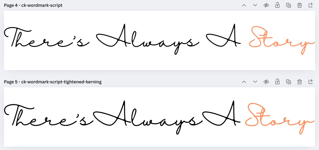
After I finished drafting this post I couldn’t resist digging further for fonts, because if you know nothing else by now, you know that I am process-driven and maybe a little obsessive when it comes to design. I found these three final options (final! I am calling it!). I wasn’t sure if the top two would work since they take up more than the middle third of vertical space.

Feeling Passionate looks good! It measures 4.5 inches.

Even though the font is more bold, Substack did not like Joella. It looks small, measuring a bit under 3.5 inches.
Majesty looks good balance-wise, at 4.75 inches wide, but the font styling is harder to read.

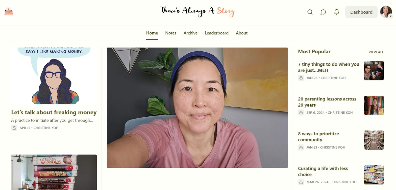
Right now, I’m sticking with Feeling Passionate. The name of this font must be a sign given that I am legitimately passionate about fonts. To whit, I have left restaurants when the menu font is bad, much to my family’s dismay. 😂 Added bonus? My design-oriented 14-year-old gave Feeling Passionate her thumbs up!
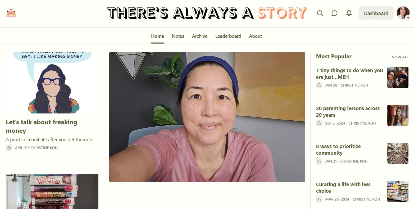
Well, I'll be danged. After struggling with this FAR longer than my tech- and design-limited brain could really tolerate, this solution WORKED.
I'm sad to have lost the little kettle graphic in my header, but not as sad as I was every time I opened my own Substack and had to squint to even SEE the header...
This is super helpful! And now I know what writing task I'm going to work on tomorrow afternoon.